Sadie Skin
Sadie Skin is a fictitious skincare brand that is organic and sustainable. Using natural elements as ingredients in the products is a core component of the brand.
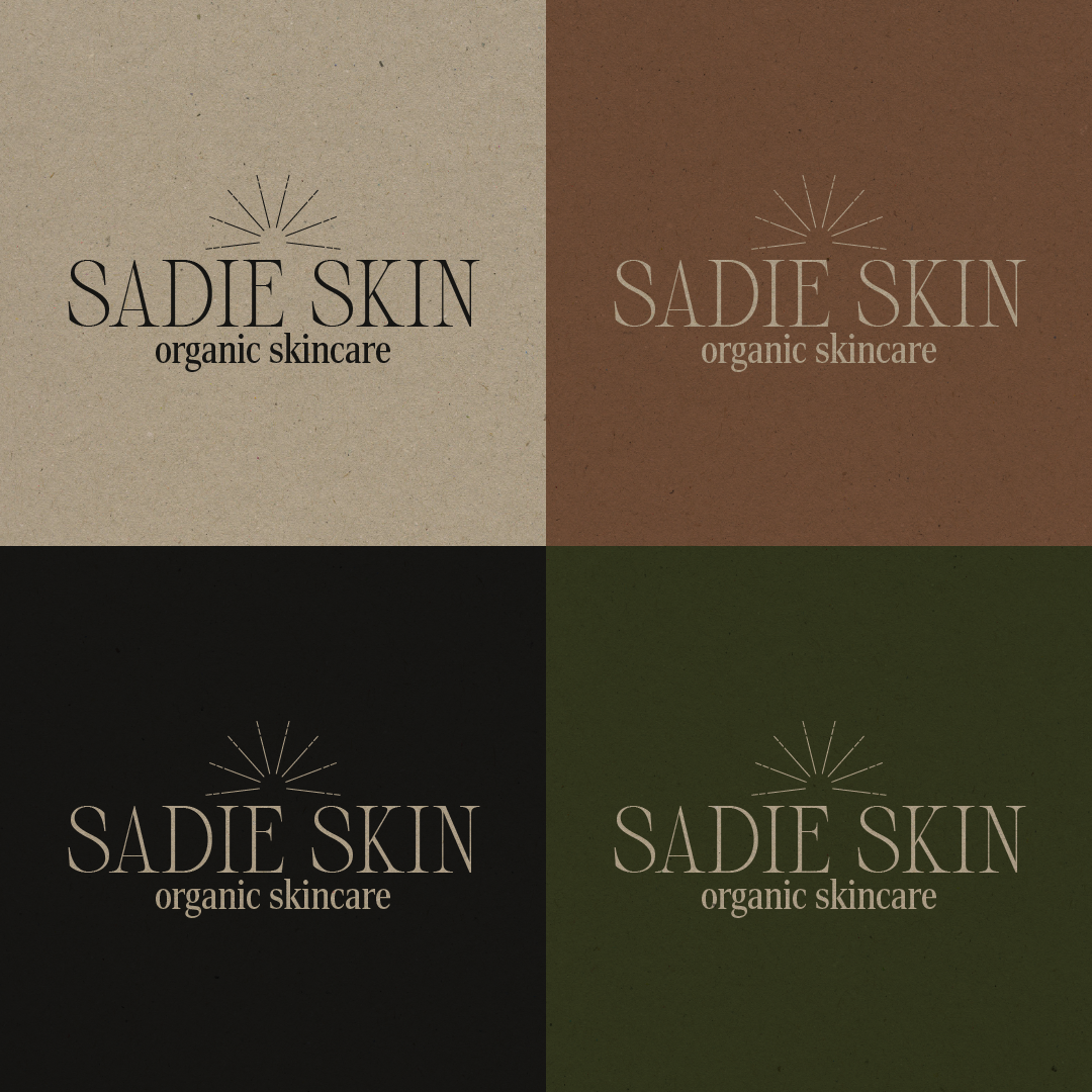
The Sadie Skin logo features a clean and modern typeface, conveying a sense of simplicity and sophistication. The use of organic, rounded edges in the lettering reflects the brand’s commitment to natural ingredients and a gentle approach to skincare. The colour palette consists of soft, earthy tones that evoke a sense of calm and purity, reinforcing the brand’s organic ethos.
Sadie Skin’s packaging is minimalist and eco-friendly, utilising sustainable materials such as recycled paper and glass. This not only aligns with the brand's organic principles but also reinforces a commitment to environmental responsibility. The design includes subtle textures that mimic natural elements, providing a tactile experience that enhances the consumer’s connection to the product.
Overall, Sadie Skin’s brand identity is cohesive, reflecting its core values of purity, simplicity, and sustainability. The combination of thoughtful visuals and a consistent colour scheme creates an inviting presence in the organic skincare market, appealing to consumers seeking effective and environmentally friendly skincare solutions. This identity not only differentiates Sadie Skin from competitors but also fosters trust and loyalty among its customer base or settings, promoting a sense of wellness and harmony with nature.


